The little dot
Product dashboards keep improving while our interpretation of them does not. On the widening gap between what we know and what we think we know.
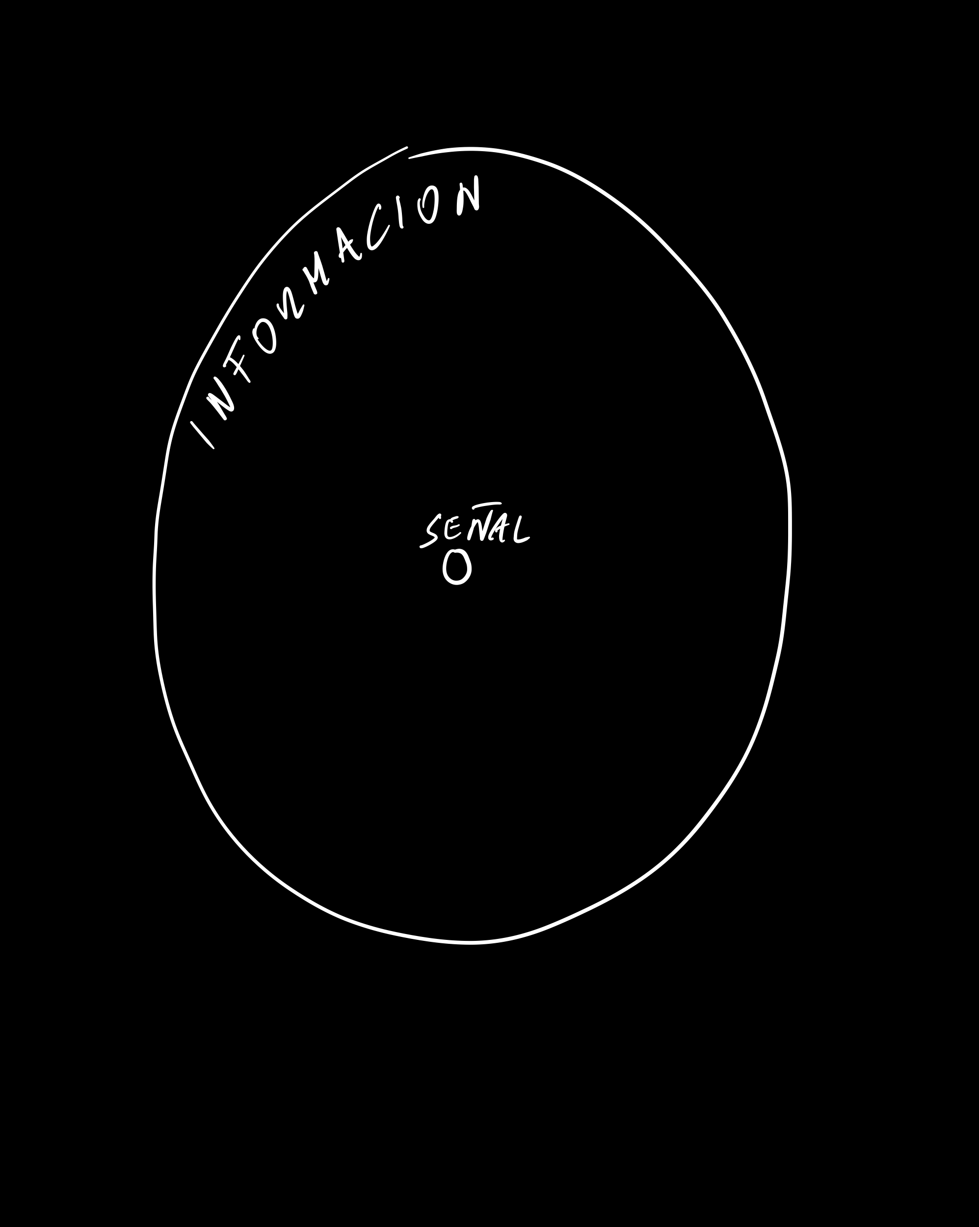
One of the pervasive risks that we face in the information age, as I wrote in the introduction, is that even if the amount of knowledge in the world is increasing, the gap between what we know and what we think we know may be widening.
— The Signal and the Noise, Nate Silver
The sentence is about forecasting, but it describes almost every product review meeting I have attended.
The gap Silver is pointing at is not a gap between ignorance and knowledge. It is a gap between knowledge and the feeling of knowledge, and the feeling is what circulates in organisations. Nobody presents a slide saying we do not understand this. The slide has a chart. The chart has a dot.
What a dot costs
Every dot on a dashboard is a compression. Underneath a single point marked activation rate: 31% there are several thousand people, each of whom arrived on a particular afternoon, in a particular mood, on a connection of a particular quality, having formed some expectation from something they read somewhere. All of that is flattened into a decimal. The flattening is not a flaw — it is the entire point of measurement, and Tufte spent three books explaining how to do it honestly.
The problem is what the compression does to our sense of standing. The number arrives looking finished. It has a colour, a comparison to last month, an arrow. It looks like the end of an inquiry rather than the beginning of one, and in most organisations that is exactly how it gets used.
Richard Saul Wurman called the resulting condition information anxiety: the gap between what we understand and what we think we should understand. Two decades of better tooling has not closed it. Instrumentation scales cheaply — adding a metric is a ticket. Interpretation does not scale at all, because interpretation is judgment, and judgment accumulates slowly in specific people who then leave the company.
So the number of dots grows and the ability to read them stays roughly flat. That is the widening gap, and it has a very specific symptom: teams become more confident without becoming more accurate.
Confidence is not the same instrument as accuracy
Kahneman's work on this is uncomfortable precisely because the mechanism is invisible from the inside. We do not experience our confidence as a separate signal from our accuracy. They arrive fused. A coherent story feels true, and a dot on a chart is a very efficient way of making a story coherent.
Taleb's contribution is to point at the shape of what the dot cannot contain. A metric reports on the population that showed up. It says nothing about the people who bounced before instrumentation loaded, the segment that never heard of you, or the failure mode that has not happened yet and will matter more than everything on the dashboard combined. The absence does not appear as a gap on the chart. It appears as nothing at all, which is much worse, because nothing is invisible.
A cheap discipline
The habit I keep returning to comes from Annie Duke, and it costs nothing: before looking at the number, say out loud what number would change your mind.
It sounds trivial. It is not, because most of the time you cannot answer it. You discover you would have found a way to be encouraged by 31% and a way to be encouraged by 24%, which means the metric was never doing any decision-making work. It was doing morale work. That is a legitimate job, but it should be labelled.
The second habit is to keep asking what a dot is made of. Croll and Yoskovitz make the case for one metric that matters at a time, and the reason is not focus for its own sake — it is that you can only hold the underlying reality of one or two numbers in your head at once. Six dashboards do not give you six times the understanding. They give you a pleasant sensation of coverage.
This connects directly to the black box problem. We do not have full visibility into our own systems, and the dashboard is precisely the surface where we pretend otherwise. It converts opacity into a rendering. Nobody lies. The chart is accurate. And still, the gap widens, because the chart's accuracy is about the past and our confidence is about the future.
The dot is not the problem. Mistaking it for the territory is.