Favour statistical thinking
Statistical thinking does not decide for you: it helps you discover, find signal in the noise, and distrust your own data sources intelligently.
Statistical thinking will one day be as necessary for efficient citizenship as the ability to read and write.
— H.G. Wells
Sometimes you can feel that twentieth-century civilisation, which arrived largely on the back of statistics, has not yet reached your work in digital product. The most sophisticated technology can be steered by wild decisions.
We devoted session 5 of the product management programme at Instituto Tramontana to this subject. And besides practising A LOT — in oral exercises, written exercises, and use cases to get our statistical thinking into shape — we went through several aspects that stand out above the rest.
It helps to start with a working definition, because the word drags misunderstandings behind it. Statistical thinking is a systematic way of thinking about how to describe the world and how to use information to make decisions and predictions or correlations, all in the context of the uncertainty inherent in reality. None of that requires advanced mathematics. What it requires, above all, is the habit of asking relative to what.
Finding the signal in the noise is not trivial
Product management involves a constant search for quantitative patterns. That search usually consists of references to magnitudes, numbers, and proportions from which to draw consequences. You need to account for several things if that activity is not to prove useless or turn against you.
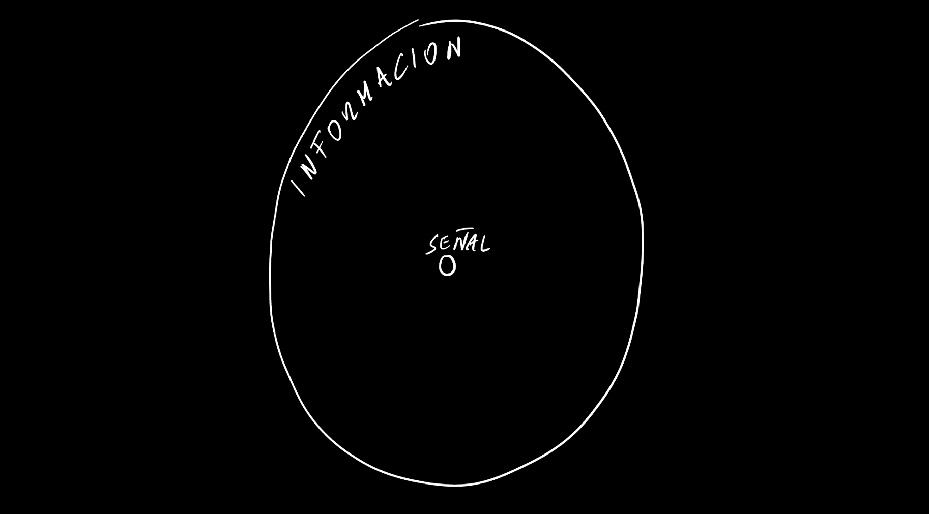
All the information we have to digest is noise until we find in it some signal that either helps us articulate the information or helps us draw a consequence to orient our action.
As we saw in the first session, and across several topics in the following ones, the information we have to handle grows in a far greater proportion than the signal we are able to find. And it is also shifting, systemic, and full of uncertain elements, which makes working with it anything but easy.
Here is a first warning: do not always assume more information is better. Be prudent when facing a data instrumentation project, because it is easy to run aground in one. It is worth keeping in mind the distinction information theory made explicit: quantity of data and quantity of information are not the same thing, and a channel can saturate while transmitting nothing new. The practical version of this is a question worth asking before widening capture: which concrete decision will improve because of having this data.
Do not take data sources for granted
In this week's exercise we had the chance to look at a public, standardised, agreed-upon source, validated on a fixed schedule: the Spanish national statistics institute. You can take that as the ideal situation, in order to draw some useful conclusions.
The first is that most of the time you will be VERY far from having a data source like that. In the quality of the data, in the validation among the different agents who use it, in the continuous generation, and in the consensus around the variables. So assume you will always work at a lower level, more provisional, fragmentary, and less established. That is your starting point.

Instrumenting data weighs more than it looks like it will before you start.
The second is that even in a scenario like that there is room for divergence in conjectures, and even in the interpretation of variables as apparently flat as population and age. We saw it in an exercise shared by just 14 people: fourteen readings of the same table produced more than one incompatible interpretation, and none of them was careless.
From these first two you should not conclude that working with data is impossible, nor that to do it you would need to reach that institutional standard. You will have to work in the wide grey between those two points. To begin with, OBVIOUS indicators are rare: almost any indicator that looks self-evident hides a definitional decision someone made long ago and nobody has revisited.

The indicators that look obvious are the ones nobody has argued about.
Statistical thinking does not decide for you
When you receive, explore, discover, or work with a piece of data, it does not live in a space without gravity. It enters what we can understand as the force field of a decision. The forces at play in that field are what give the data its final meaning: the urgency of the moment, the incentives of whoever is looking, what was decided last quarter, the relationships between the people in the room. You have to take them into account, both regarding yourself and regarding everyone else, in order to do something useful with that statistical dimension.
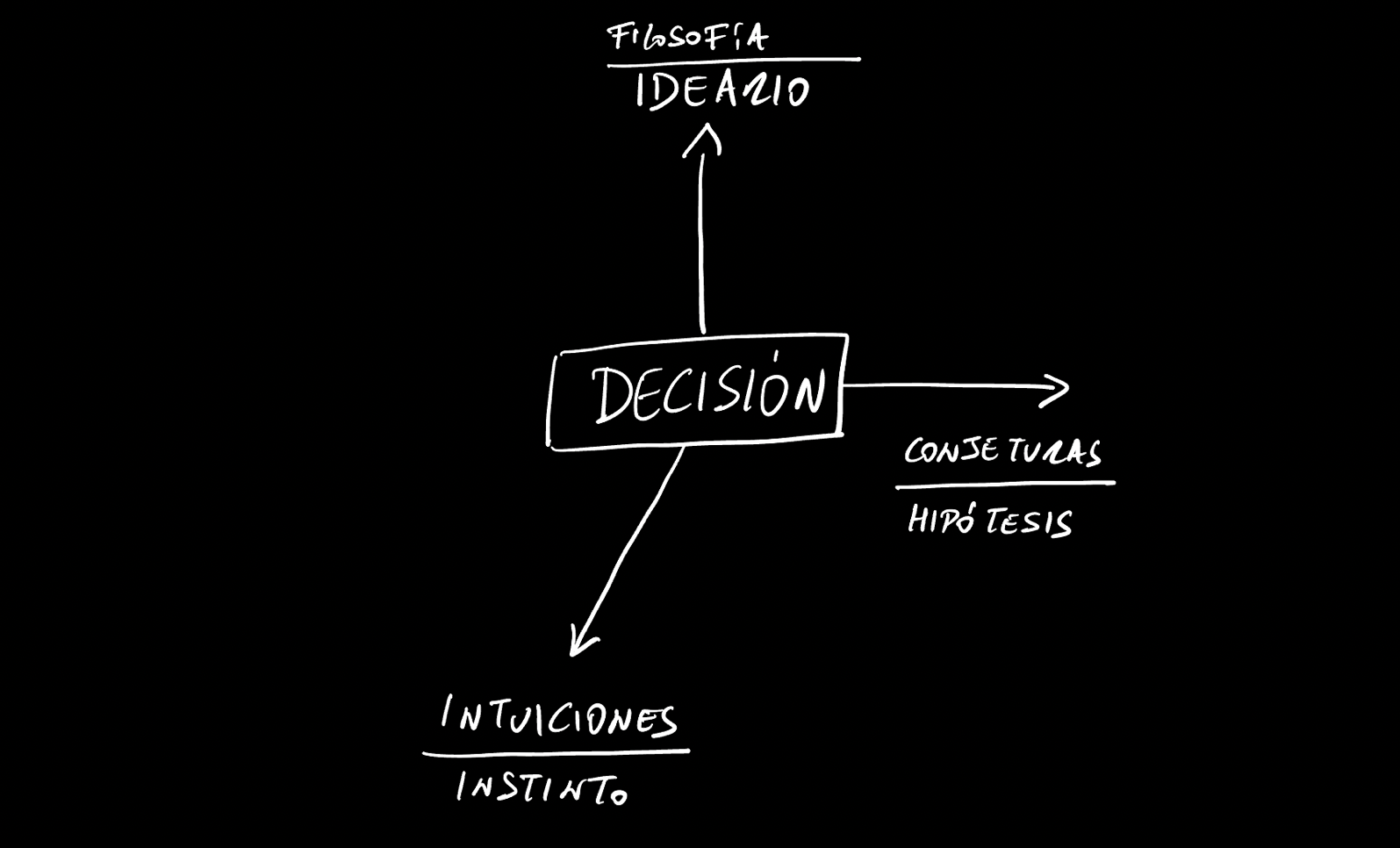
A number enters a decision that is already being pulled from several directions.
This is not an argument against rigour, it is a description of where rigour happens. The opposite illusion — that a sufficiently good number settles the argument — produces two equally bad outcomes: either the definitive data point is sought indefinitely and never arrives, or a mediocre one is granted an authority it does not have because the meeting had to end.
Testing our intuitions, opinions, and instincts
You cannot draw progressively better-fitting consequences unless you test your intuitions against the statistical references available to you. You can think of it this way: every time you obtain better statistical references, what you are doing is widening your sample relative to the whole population. The box plot schema, dividing the extremes from the central part along with the percentages represented, can help you understand what the main statistics are good for.
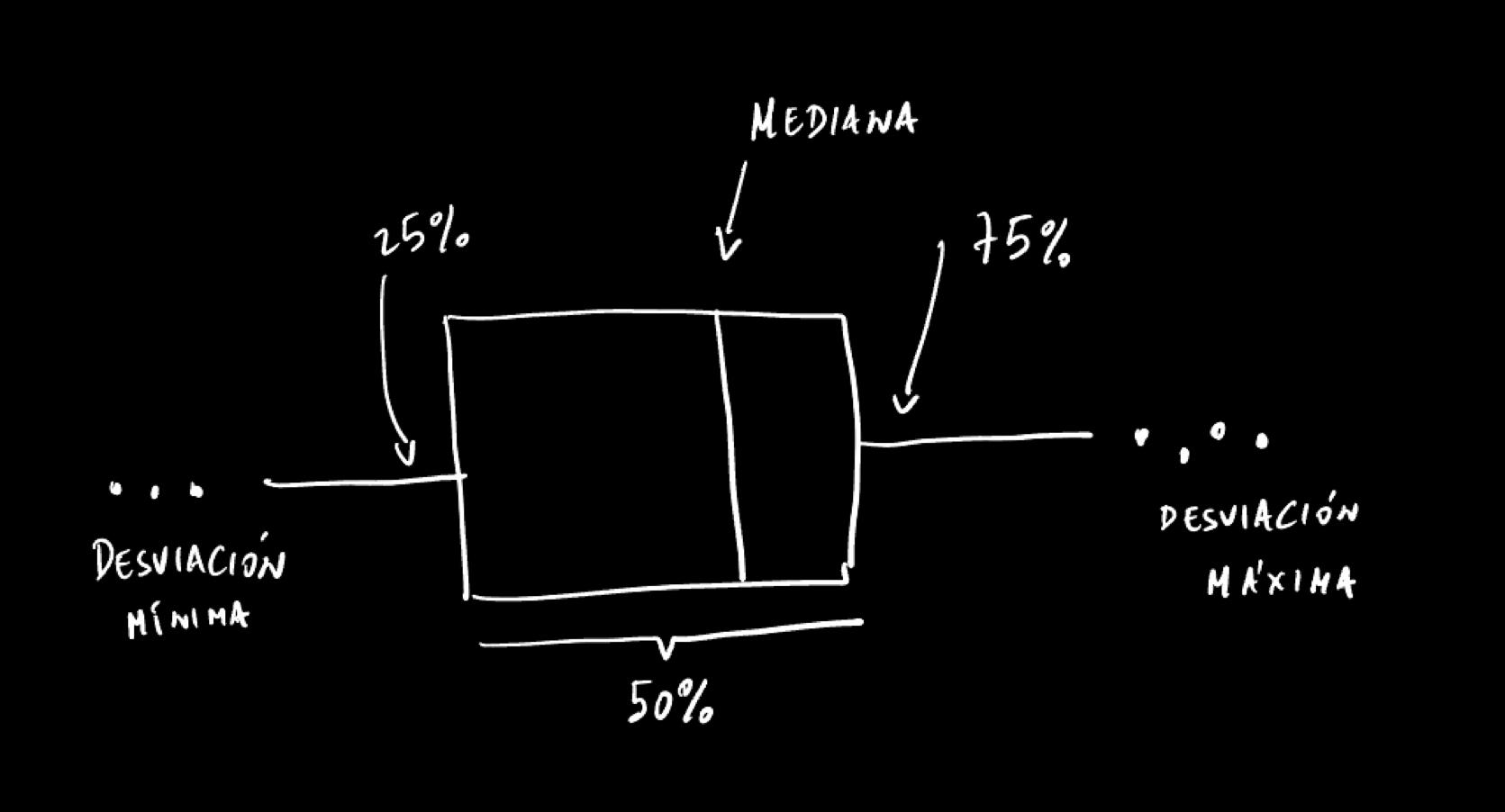
The box plot separates the extremes from the central part.
Statistics let us apply a simple but powerful operation: starting to group things relative to the whole. We can establish a correspondence between statistics and segments, and from there start thinking about every element of a product from a multidimensional view, and about features by dimension. It is an exercise that changes the prioritisation conversation considerably: instead of arguing about whether a feature is important, you can argue about which part of the distribution it is important for.
Visualisation is a very effective tool for recognising quantitative patterns. It is often the best way to find something while exploring data. It also helps a great deal when you want a feel for the frequency, the rhythm of something. There are common shapes worth internalising: bells, inverted bells, slides, peaks over valleys, waves. Tufte insisted that a good chart is not one that decorates an argument but one that lets you compare; and comparison is exactly the operation you need when you do not yet know what you are looking for.
Thinking in magnitudes to obtain relative metrics
Thinking in inexact numbers is the best way to accustom your senses to the magnitudes you work with. Exact numbers are convenient for objectives; magnitudes are convenient for framing possible initiatives.
Thinking in magnitudes puts you in the territory of relative measures, which is where a conjecture can begin. Exact numbers in a vacuum mean nothing. Once you place them on a scale and in relation to other points on that scale, they become interesting and can be the start of some action.
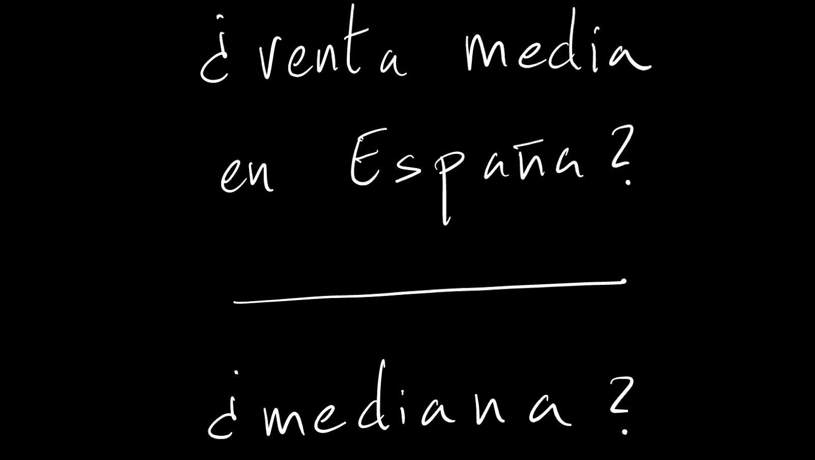
The same question takes two very different answers depending on which statistic you use.
You will frequently face actions and objectives that in many cases are not contextualised — that is, they have no scale and no relative reference. Quantifying lets you start dismantling that first obstacle, establishing a confidence level and from there some probability, even an intuited one.
Statistics for discovering and understanding, not so much for predicting
Reaching causality, and with it prediction, cannot be your first objective when working with statistical references. The first benefit is usually being able to discover things that were otherwise simply unknown unknowns. In that sense, statistical thinking is a useful tool for understanding and finding potential improvements that would otherwise stay hidden.
It is an inversion of priorities that is hard to accept, because all the organisational pressure pushes the other way: what gets asked for is a forecast, not a finding. But demanding prediction from an instrument that can barely describe the present well is the fastest way to discredit it, and to have the organisation conclude, after the second failed forecast, that data is useless. I returned to this idea when writing about favouring thinking with metrics and about organisations that, with data in abundance, still decide innumerately.
What if the problem were not that we lack data, but that we lack the habit of asking relative to what?